
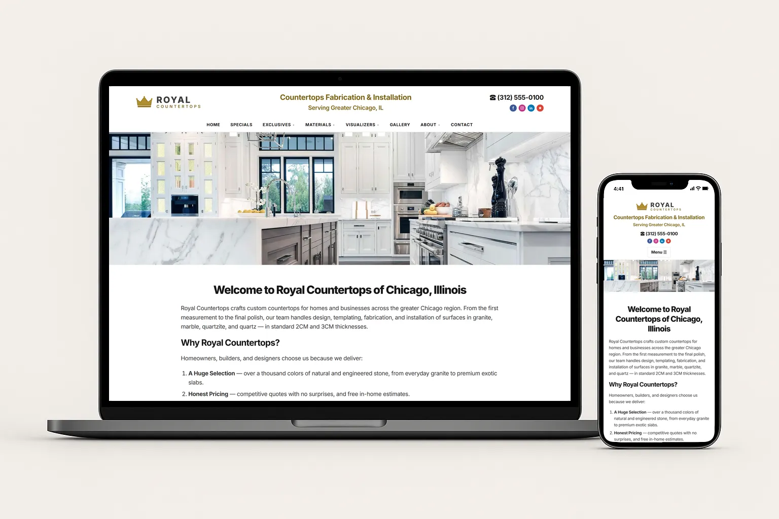
A homeowner deciding between three countertop shops rarely picks the one with the best slabs. They pick the one that feels easiest and safest to hire — and in 2026, that judgment happens on your website, in the first few seconds, on a phone. Your shop can run flawless seams and carry the best quartz in town, but if your site is slow, the photos are stock, and the quote button is buried, you lose that $4,000–$9,000 job to a competitor whose site simply made it easier to say yes.
Your website is your hardest-working salesperson, and it never takes a day off. This guide walks through the exact design decisions — speed, galleries, quote CTAs, visualizers, mobile, and trust — that turn anonymous browsers into booked measure appointments and high-value retail jobs outside of referrals.
Why your website decides who wins the job
Every dollar you spend on Local SEO, Google Ads, or Local Service Ads ends in the same place: your website. That makes it the single biggest multiplier — or leak — in your entire marketing system. Drive 100 visitors a month and convert 2% of them, and you book two jobs. Tighten the design until you convert 6%, and you book six from the exact same traffic and ad spend. Nothing else in marketing offers that kind of leverage.
The buyer's mindset matters here. Choosing a countertop is a considered, high-trust purchase. People want proof you do clean work, show up on time, and will not surprise them on price. Your website either supplies that proof instantly or it does not — and the numbers below show how unforgiving that first impression is.
The pattern is clear: speed and credibility are not nice-to-haves, they decide whether an expensive visitor ever becomes a lead. Let's start with the one that quietly loses the most jobs.
Speed: the silent deal-killer
Countertop sites are photo-heavy by nature, and that is exactly what makes so many of them slow. Large, uncompressed images, a bloated page builder, and a dozen tracking scripts can push load times past five or six seconds — and more than half of mobile visitors are gone before your gallery even appears. Worse, Google factors page speed into rankings, so a slow site costs you both conversions and visibility.
To keep your digital showroom fast:
- Compress and resize every photo, and serve modern formats like WebP.
- Lazy-load gallery images so the page is interactive before everything downloads.
- Build on a lightweight, modern framework instead of a heavy drag-and-drop template stuffed with plugins.
- Trim unnecessary scripts, fonts, and pop-ups that delay the first meaningful paint.
- Test on a real phone over cellular data — not just your office Wi-Fi.
Quick win
Run your site through Google's PageSpeed Insights and look at the mobile score. If your largest images are over a few hundred kilobytes each, compressing them is often the single fastest way to drop a second or two off your load time — and recover the buyers who were silently bouncing.
Galleries that sell the slab
Stone is visual, so your portfolio is your strongest sales tool. Stock photos quietly tell a buyer you have nothing of your own to show. Real, high-resolution photos of your finished kitchens and bathrooms do the opposite — they prove craftsmanship, build desire, and let a homeowner picture their own remodel.
- Lead the homepage with a bold hero gallery of your best finished installs.
- Shoot edges, seams, waterfalls, and veining up close — the details that justify a premium price.
- Let buyers filter by material (granite, quartz, marble) and by room so they self-select.
- Pair before-and-after shots to dramatize the transformation you deliver.
- Caption projects with the material and city to support Local SEO at the same time.
A great gallery does double duty: it sells the job and it moves you toward a price-war exit, because buyers who can see premium work are willing to pay for premium work.
Quote CTAs that actually get clicked
Beautiful photos mean nothing if the visitor can't figure out how to hire you. The most common conversion leak on fabricator sites is a single tiny "Contact" link in the navigation. A ready buyer should never have to hunt.
- Use a sticky "Get a Free Quote" button that stays visible as the page scrolls.
- Repeat the CTA after every gallery and trust section — people convert at different moments.
- Keep your quote form short: name, phone, project type, and a photo upload beats a 12-field form.
- Set clear expectations — "We reply within minutes during business hours" reduces hesitation.
- Make the button copy specific and benefit-driven, not a generic "Submit."
Is your website actually booking jobs?
We build fast, photo-forward countertop sites engineered to turn shoppers into measure appointments — with exclusive leads that go only to you. Book a free growth call and get a candid audit of your current site.
Schedule a Free AppointmentVisualizers & material selectors
Many countertop shoppers land on your site undecided — quartz or granite, light or dark, classic or waterfall. If your site does not help them explore, they leave to research elsewhere and may never come back. Interactive tools keep them on your page, engaged, and moving toward a decision.
- A visualizer that previews materials in a kitchen scene helps buyers commit to a look.
- A filterable material library — by color, finish, and price tier — guides them to a confident choice.
- A simple cost-estimator or "starting at" pricing range sets expectations and pre-qualifies leads.
- Even a well-organized "Our Materials" page reduces the back-and-forth that stalls a sale.
The point is engagement: every extra minute a buyer spends picturing their finished kitchen on your site is a minute they are not on a competitor's. Tools like these also nudge shoppers toward higher-end, premium selections rather than the cheapest option — exactly the high-value jobs you want.
Mobile-first or invisible
Most homeowners research countertops on a phone — often standing in the kitchen they want to remodel. If your site is designed for desktop and merely tolerated on mobile, you are losing the majority of your traffic at the most important moment. Mobile is not a smaller version of your site; it is the main event.
- Add a persistent click-to-call bar so calling takes one tap, not a search through the page.
- Use large, thumb-friendly tap targets and readable text without pinch-zooming.
- Make galleries swipeable and fast — no slow carousels that jank on a phone.
- Keep forms short and use mobile-friendly inputs (a numeric keypad for phone fields, for example).
- Test the full path — search, gallery, quote — on an actual phone before you ship.
Don't make them dig
Your phone number, service area, and a quote button should all be reachable within one tap from anywhere on the mobile site. The shops that win are not the ones with the flashiest design — they are the ones that make hiring effortless on the device buyers actually use.
Trust signals near every CTA
A homeowner is about to invite a stranger into their home and hand over thousands of dollars. Right at the moment they consider clicking your quote button, they need reassurance. So put your proof exactly where the decision happens — beside the button, not buried on an "About" page.
- Show your star rating and recent reviews next to quote forms and contact buttons.
- Display the Google Guarantee badge, any certifications, and your warranty or workmanship guarantee.
- Feature real customer names, cities, and photos — generic testimonials read as fake.
- Add an "as featured in" or partner logos row if you work with known designers and builders.
- Be transparent about process and timelines so the buyer knows what happens after they hit submit.
Putting it all together
A high-converting countertop website is not one big feature — it is a stack of small, deliberate decisions that remove friction and build trust at every step. Speed earns the visit. Galleries create desire. Clear quote CTAs capture the lead. Visualizers and material selectors keep buyers engaged. Mobile design meets them where they already are. And trust signals give them the confidence to click.
Get these right and your website stops being a brochure and starts being a salesperson — one that turns the traffic you already pay for into booked measures and premium projects. That is exactly the kind of conversion website we build for countertop shops: fast, photo-forward, and engineered around revenue, not vanity metrics.